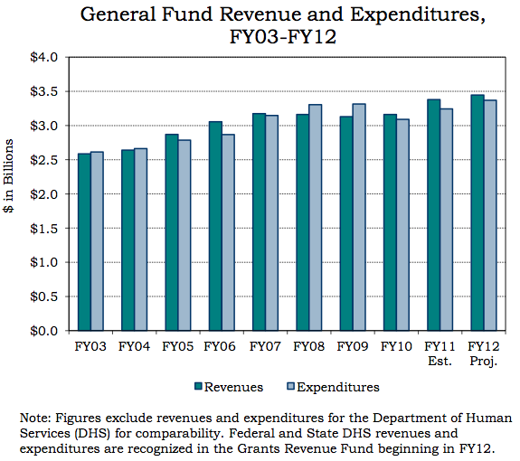
How the City of Philadelphia spends $3.5 billion annually should be better visualized online, we say.
The state-empowered Philadelphia Intergovernmental Cooperation Authority (PICA), which is chaired by investor and former mayoral candidate Sam Katz, released in November a citizen’s guide to the City of Philadelphia General Fund that was full of visualizations — all buried in a PDF.
While we shared the document a few weeks ago, after seeing it on PhillyDeals, it seems that it all passed with too little fanfare. While we at Technically Philly would love to work with PICA to develop a friendlier, more interactive web version of this project, we thought we’d start by sharing our 10 favorite of the many charts and graphs detailing where the city government gets its money and how it’s spent.
In addition to the one above, see our 10 favorites below.
Also see the original PDF here or here (Technically Philly strongly recommends you give the document a look for additional explanation for much of the information below).
REVENUES
Distribution of Fiscal Year 2012 General Fund Revenues

Distribution of Fiscal Year 2012 General Fund TAX Revenues

EMPLOYMENT
How many city employees

Percentage change in city employment by agency

EXPENDITURES
Percent of budget distributed by function

Percent of budget distributed by agency

Comparing the 10 largest U.S. cities by expenditures

TAXES
Tax revenue and rate

Comparing 10 large U.S. cities by state and local tax burden

Comparing 10 large U.S. cities by percentage of tax revenues

Before you go...
Please consider supporting Technical.ly to keep our independent journalism strong. Unlike most business-focused media outlets, we don’t have a paywall. Instead, we count on your personal and organizational support.
Join our growing Slack community
Join 5,000 tech professionals and entrepreneurs in our community Slack today!

The person charged in the UnitedHealthcare CEO shooting had a ton of tech connections

The looming TikTok ban doesn’t strike financial fear into the hearts of creators — it’s community they’re worried about

Where are the country’s most vibrant tech and startup communities?


