Maps are the lifeblood of the internet and also a really useful way of understanding the world we live in.
As a community-oriented technology site, maps are among our most important stories. And luckily, Brooklyn is a global center of people organizing information geographically and beautifully. So take a minute to check out the best maps of 2015.
1. What’s your quality-of-life index? Data viz site PlaceILive has the answer
Visualize the facts of your neighborhood: unemployment, income, liquor stores.

Concentration of families that speak only English. (Screenshot)
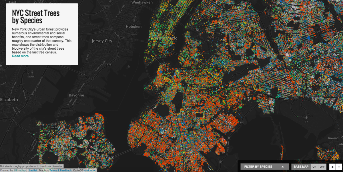
2. Help! Is this Greenpoint or Williamsburg?!
The several blocks north of McCarren Park are trapped in a limbo zone of neighborhood identity. According to Google, at least.

A debate for the ages, surely.
3. Calculate the solar power of your roof with this tremendous map
Mapdwell brings solar capacity knowledge to New York City.

The solar potential of NYC. (Screenshot)
4. A bike accident, a surgery, a map of death in New York City
A serious accident gave a Brooklyn software engineer a new perspective on death in the city. That’s why Zach Schwartz made Death Map NYC.

Death Map NYC shows the site of each homicide and motor vehicle death in the last two years. (Screenshot)
5. Map alert: How toxic is your North Brooklyn ‘hood?
All those lofts? They used to be factories.

Pollution in Brooklyn. (Screenshot)

Drop a bin! Help the ‘hood! (Courtesy image)
Join our growing Slack community
Join 5,000 tech professionals and entrepreneurs in our community Slack today!
Donate to the Journalism Fund
Your support powers our independent journalism. Unlike most business-media outlets, we don’t have a paywall. Instead, we count on your personal and organizational contributions.