Canva, the online design platform, was pretty much made for AI. Since it first came out a decade ago, it has become the go-to site for making really easy graphics at a time when you really needed some decent Photoshop skills to pull it off.
Nothing beats a good designer, but in a social media world, Canva does the trick for everyday posting that’s laid out with text and branding.
Over the last few weeks, Canva has been counting down the days to the launch of its new, premium Magic Studio.
I use Canva fairly regularly for social media posts — my only connection to the company (no sponsorship here). I thought I’d try and use Magic Studio to create an Instagram post for one of my recent articles. Here’s a breakdown of how it went, and what you can learn from my experience.
How is Magic Studio different from Canva’s existing AI tools?
Canva has been offering AI tools for a while now, generating designs using a chosen color scheme and general theme that you can simply drop your own images and text into. Magic Studio goes further by generating designs based on a prompt of five words or more. It then gives you results, including relevant images (that you can replace with your own) and generated text.
In theory, you can use a design just as generated. In my first-day test, that was a stretch. But it did generate pithy text by itself that was actually more impressive than the visuals.
Prompt: “instagram post about an article about virtual acute care nursing and healthcare technology”
This prompt is based on a recent article about ChristianaCare. After a few seconds, I got a selection of designs:

The designs are very basic, but two things stand out: The photos are directly related to healthcare, and it came up with its own wording that I didn’t use in the prompt, such as “revolutionizing healthcare.”
I had a photo I wanted to use, but it wasn’t going to be a good fit with most of the designs I got, so I re-ran the prompt with “landscape photo” added to the end.
The results were not much different and included several designs that still wouldn’t work with the photo, but there was this one:

Not super exciting, but usable.
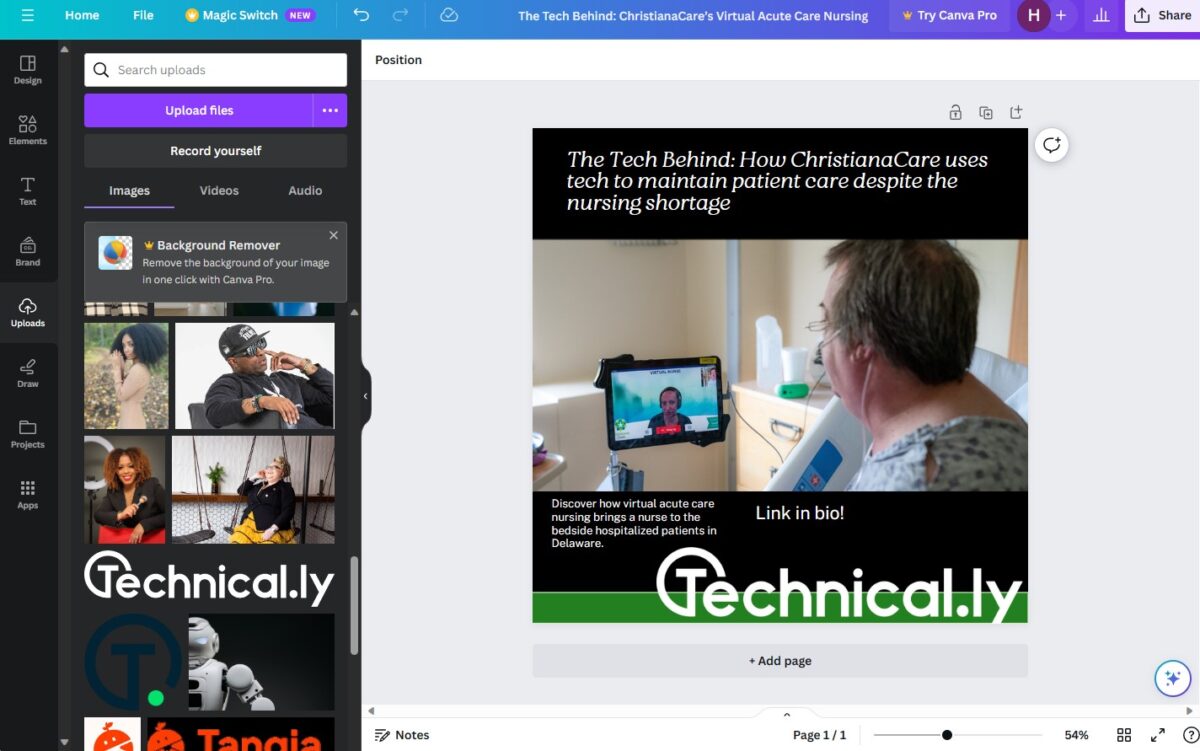
I uploaded the photo, rewrote the text and added the Technical.ly logo. The color scheme was all wrong, so I swapped it to a dark background, traded the lavender stripe for green and wound up with this in less than five minutes:

Not bad for its first day.
I used the Magic text-to-image tool for free, but it did cost one of the 10 promotional tokens in my free account. To get the full use of Magic Studio, you will need a paid Pro account. Some of the new AI features include a tool that turns one format to another with a click (for example, a slideshow into a report) and text to video.


