The 2012-2013 flu season is the worst in a decade, according to the Centers for Disease Control and Prevention.
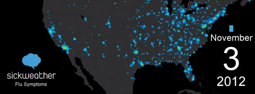
And if you can’t take the CDC’s word for it, take Chris Whong‘s word for it. Whong, owner of Federal Hill-based Charm City Networks who’s presently completing a master’s degree in urban planning at New York University, has put together an animation that plots reports of the flu in the the United States from October 2012 through early January as a heatmap.
Whong turned to Sickweather, the illness-mapping startup that combs Twitter and Facebook status updates for mentions of sickness, for the flu data. As one might expect, flu is running rampant up and down the Northeast Corridor, which means carrying a bottle of hand sanitizer on your next Amtrak trip might be worthwhile.
Or, if you’ve been using Sickweather, you already had this flu season predicted six weeks before the CDC did, and stocked up on orange juice that is not from concentrate.
This is the second animation Whong has put together. His first, which was a time-lapse heatmap of homicides in Baltimore city from 2007 through September 2012, can be viewed here.
[youtube https://www.youtube.com/watch?v=UZgOr2KLzt0]
Sickweather flu map: Chris Whong’s animation plots the spread of flu in U.S. using Sickweather data [VIDEO]


