It might make sense for two guys who attended Maryland Institute College of Art (MICA) to team up and start a creative studio. But for Nolen Strals and Bruce Willen, it was playing in a heavy metal band that sealed their fate.
“It was more like a hardcore band, but we thought we were gonna be heavy metal,” quipped Willen, as he and Strals laughed. “We weren’t talented enough to actually play heavy metal.”
The co-principals of Post Typography got their start as a creative duo making posters and T-shirts for their band. Even after taking different jobs post-graduation, including a move to Delaware, the two were still united by music. They continued playing together while picking up art and design projects on the side. It only took a few years for the guys to realize they may have found a viable way to support themselves through their collaboration.
In the Spring of 2007, they left their day jobs behind and began operating full time as Post Typography.
Characterized by smart work that doesn’t take itself too seriously, Bruce said Post Typography enjoys taking on work that has a strong idea at the heart of the project.
“We’ve had the good fortune, and this was also by design of course, of working with clients whose missions we can really get behind,” said Willen, which he admitted isn’t always the easiest thing in any industry.
As Nolen talks the need for informational clarity by means of typographical hierarchy, it is clear there is much more needed to be a good designer than what meets the eye.
Typography is a core graphic design skill, he explains, “but one of the more difficult things to master because it requires … reading and digesting and understanding the message, not only what looks good, but how you want someone to read and absorb the information.”
Typography is the style and appearance of what is seen in print, so, as Strals explains, they take the client’s information, whether for a product or service, and ensure it is communicated in a way that is effective and properly digestible for consumers. That includes deciding which information is in a larger font or a bolder color to catch the reader’s eye first, or which font is used to convey the humor or seriousness of a project.
The studio works with commercial clients, as well as arts organizations, nonprofits and government agencies. Most recently, they have done branding and environmental design for the Maryland Film Festival’s Parkway Theatre, meaning they’ve designed logos, white-on-white signage that wraps around the corner of the new building, subtly glowing at night and wayfinding graphics painted in vibrant colors directly on the walls of the 100-year-old building to help visitors find their way.
The design studio includes detailed case studies on their recently redesigned website, PostTypography.com. Each study highlights their creativity and diversity in graphic design, branding, typography and more.

For nine years, they toured the U.S. and Europe as two-thirds of the band Double Dagger, a part of their background they both attribute to their ethical draw.
“Our punk background informs our ‘we’ve-never-done-this-before-but-we-can-do-it-now” mentality.” said Strals. “It definitely influenced us in that we are drawn to ethical clients; to clients that are often trying to improve the city or the world. I think that all goes back to our punk rock roots.”
“Punk has taught us the importance of community,” Willen added. “And I think we’ve tried, where applicable, to bring that to running a business.”
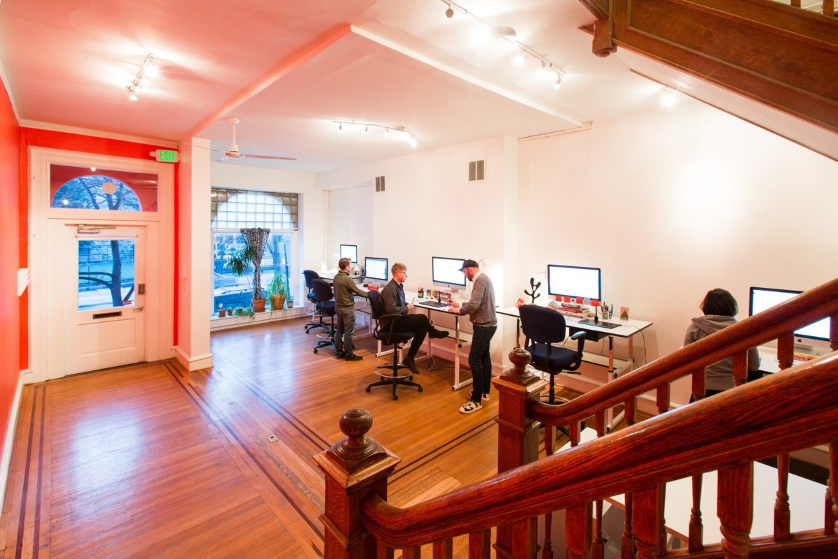
About seven or eight years ago, the two-man studio made its first hire and now operates with a team of a half-dozen people.
That sense for community influences their studio in Baltimore. One of their current projects includes designing branding and signage for Baltimore’s Union Collective, a large warehouse complex that will be home to Union Craft Brewing and more growing independent businesses this year.
“We love the city,” said Strals, “and all of our clients here and to work with the people here because there is more of an opportunity to connect more closely.”
One initiative aimed at city life is the U.S. Forest Service’s Vibrant Cities Lab, whose new website and graphic identity the studio was asked to create. The initiative is a one-stop shop for urban forestry, which Strals described as a 21st century urban planning tool because of the trees’ effectiveness at cleaning the air, reducing stormwater runoff, and raising property value. He said they are even shown to reduce crime. This project for them was less about showcasing their humor, Nolen said.
“What we brought to it was a brighter, fresher, more energetic look, but balanced with really strong and dynamic typographic hierarchy,” he said. “So it balanced a classic formalism with a really contemporary and energetic look.”
Post Typography wanted to bring new life to these positive attributes that relate to running a 21st century city. The duo brought contemporary design to a subject that’s not “super trendy” because of its need still to be authoritative. Willen said that it’s a science website ultimately, but they wanted it to feel accessible.
As Post Typography’s profile has “come up” in the city, he said, they’ve been able to do and keep a lot more work in the region, too.
They pride themselves on being an interdisciplinary studio, tackling work that ranges from digital to writing, messaging and brand strategy to 3D pieces and work in the built environment.
“I think one of our strengths is that we do such a wide variety of work. We have a lot of flexibility with our skillset and our experience,” said Willen.
Post Typography is also set apart by some “crazy and ambitious” work, which Willen believes drives people to seek them out.
A recent example comes at Light City, the studio collaborated on a 25,000 sq. ft. underwater light installation, in collaboration with PI.KL Studio and Figure 53’s QLab. Called “Some Thing in the Water,” it contains 33,600 LEDs and an immersive sound design by Willen.
Complex projects don’t scare them, either, as both believe they thrive when they have a “giant beast to tackle” and can distill complicated ideas into something clear and digestible.
“Clients know that’s something that excites us a little more and us and the client can push each other,” Bruce said.


