
The most difficult part of telling a story, be it with words, data or images, is figuring out what that central piece of information is and building your narrative around it. There’s always that one piece of information your reader, viewer or user is looking for — you, the creator, have to be humble enough to ask yourself what that is, not what you want it to be.
This is one of Carla Uriona’s main philosophies on storytelling and information sharing.
When Uriona saw the Washington Post’s SafeTrack graphics in May she thought “these look nice, but they don’t show me what I need.” Ironically Uriona’s not a metro rider herself, but she thinks that when disseminating SafeTrack information it is important to think like one.
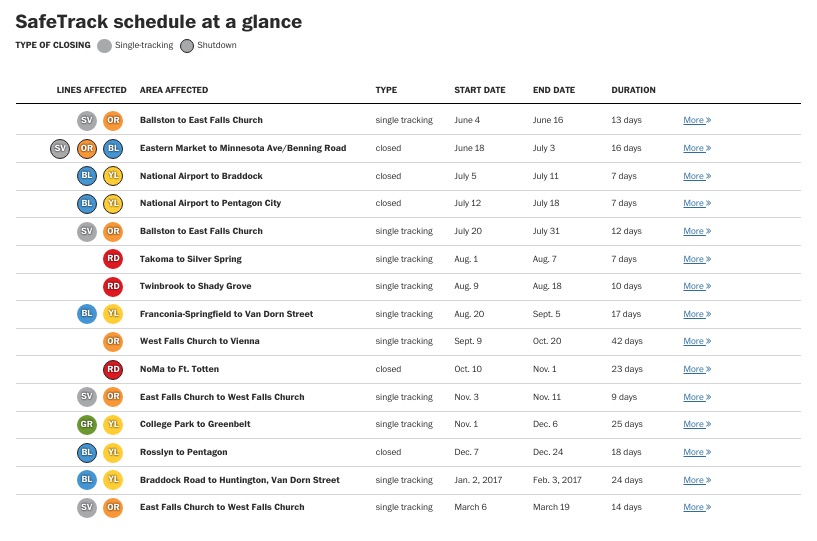
The Washington Post SafeTrack graphic that Uriona decided to play with. (Screenshot)
And so Uriona decided to create her own version of the graphic. Why? Well, she told Technical.ly, “I’m a designer by trade, and it’s in our DNA when we look at things to think about how to make it better or different.”
Uriona asked herself: “What does a metro user need to know?” and got to work. Her version of the metro closure schedule is presented as a calendar, with affected lines drawn over the dates where single tracking or complete closure is scheduled to take place. The graphic also overlays information about nearby Capital Bikeshare stations (two blocks away or closer), to provide users with another transport option.
It looks like this:
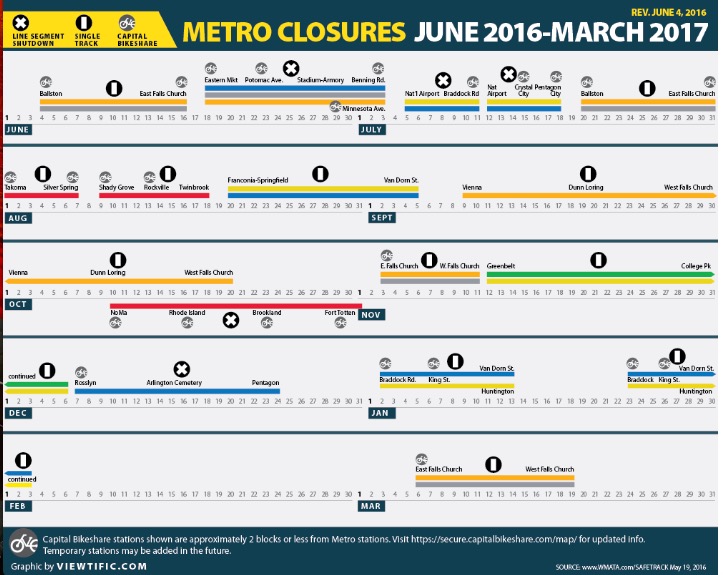
Carla Uriona’s visualization of the SafeTrack schedule. (Screenshot)
Check out the graphic and Uriona’s commentary on it here.
Uriona posted the graphic on her personal blog viewtific, where, she told Technical.ly, she meditates on the ethical responsibility of designers to make information more clear rather than obfuscate data for the sake of a preconceived narrative. It’s a mission Uriona feels really strongly about, and it makes for interesting reading. Check out her work here.
Join the conversation!
Find news, events, jobs and people who share your interests on Technical.ly's open community Slack

'Be bold': This digital innovation and business strategist urges fellow women leaders to be their authentic selves

New DMV conference aims to connect women innovators and developers

What US entrepreneurs can learn from a Chinese policy wonk: Build with your values in mind
