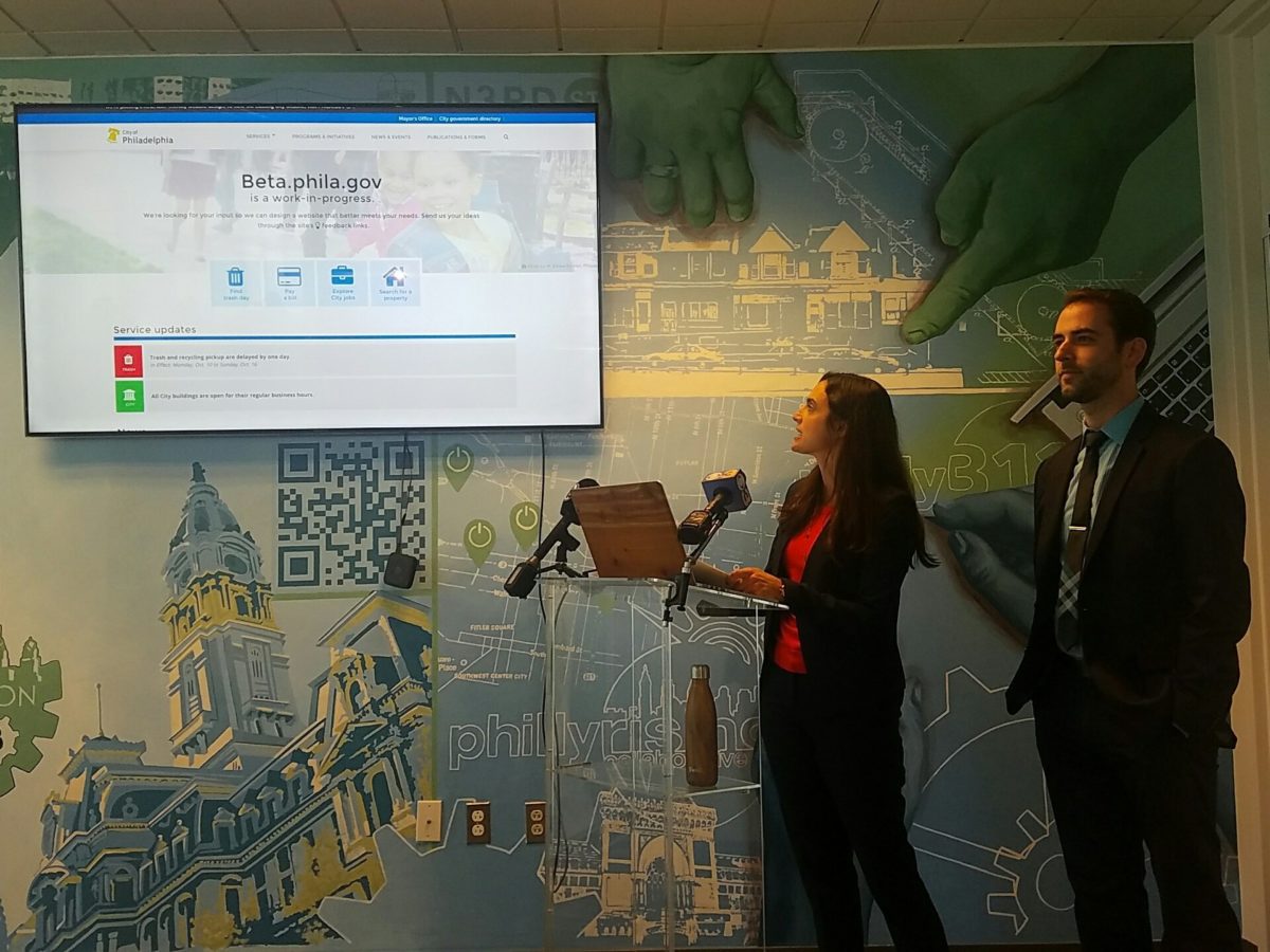
Philly’s digital front door got an upgrade today: the beta version of its website just went live.
During a press conference on the 16th floor of the Municipal Services building, home to the Office of Open Data and Digital Transformation (ODDT), the City of Philadelphia’s recently redesigned website was unveiled by Chief Administrative Officer Rebecca Rhynhart and Chief Data Officer Tim Wisniewski.
As you may recall, the alpha iteration of the site was first released in December 2014. Following a four-month redesign process led by ODDT’s team of eight — plus a few shifts in management along the way — the beta version is now live, and will embark upon a UX testing period which will eventually lead it to drop the beta and become the city’s official website.
Accoding to Rhynhart, that last step is slated to happen sometime in 2017.
“Rather than waiting until we can update the thousands of pages on the city’s website, we wanted to unveil this today and be able to interact with people through the beta website,” said Rhynhart.
Wisniewski said the changes to the portal are expected to improve user experience, and that the redesign — similar to the alpha site — prioritizes giving citizens access to the services they’re looking for.
Here a few highlights from the new site’s launch:
1. A global navigation tool
The new site’s top navigation menu will follow users around as they browse the site. The tool offers a centralized way to access things like programs, news and events under an agency-agnostic philosophy.

That means wonky services like, say, net profit tax payment for businesses can be found directly on the portal through the category dubbed Payments, assistance, & taxes instead of having to go to the site of that specific agency.
https://twitter.com/TechnicallyPHL/status/786933382550687745
2. Fresh content (this one we really like)
Loads of content from city agencies — like the Mayor’s Office of Education or the Office of Sustainability — was completely rewritten and updated with assistance from policy experts from the pertaining office. (The Department of Revenue, responsible for 30 percent of visits to the site, rewrote most of its content and will roll out the rest over the fall.)
3. There’s a mobile version
We’ll let Wisniewski himself fill you in:
https://twitter.com/TechnicallyPHL/status/786947505124544512
4. The site will be tested
As of today, the city is kicking off a review process for the site, complete with workshops and usability testing sessions together with city staff and the public at large. Interested in giving your two cents? Join the beta testing by filling out this volunteer form.
So overall, what does this shift mean for the city’s digital presence? It looks fresher, yes. It eases access to services, yes. The next challenge? Polishing the beta version to a stage where it can officially become Philly’s “digital front door,” as Wisniewski puts it.


