The Federal Occupational Health Division of the Department of Health and Human Services. With a name that long, you’d see why the federal agency would want to hire a handful of scrappy DIY developers to work on its UX.
The FOH HHS happened to be one of the first clients of Brave UX, a boutique user experience firm that handles tasks ranging from complex governmental portals to whatever side-project they’ve decided to take on.
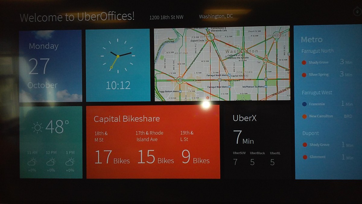
Brave UX noticed, for instance, that the TV screen facing the elevator in UberOffices Dupont was not being put to good use. So the team tinkered around and made the Compass Dashboard, an application that displays a weather forecast and information on the nearest Capital Bikeshare station, metro stations or Uber vehicles.

What was originally designed just for UberOffices soon took off among local realtors, including MRP Realty.
The best value we bring to our clients is a different perspective.
The team of eight at Brave UX is also responsible for a less cashable project: For the Badge, which allows GitHub users to proudly identify things about their code that range from “Made with Ruby” to “Mom made pizza rolls” to “contains cat gifs.”
“It produced a lot of chuckles,” said founder Lee Finkel, a Long Island native with Macklemoreish looks who is also a member of NextGen Angels. Finkel started his first company as a junior at the University of Maryland, where he participated in the Hinman CEOs entrepreneurship program alongside Squarespace founder Anthony Casalena. In February 2014, he launched Brave UX.
UX is the most important piece of the digital world. We want to make an impact.
But the design firm is also about preparation — a lot of it — and painstakingly polished designs.
“The best value we bring to our clients is a different perspective,” said Finkel. Before embarking on any project, he said, the team spends four weeks discussing the project and “whiteboarding solutions” with the client. More importantly perhaps, “we also talk to your users.”
That’s the tack Brave UX used to design the wellness portal for the FOH HHS (Where millions of HHS employees can stay on track for their wellness benefits program). Inspired by cutting-edge research from the National Institutes of Health, the team crafted a portal that responds differently to different personality types: you can be configured like a” boot-camp type person,” for instance, or a “Zen-type person.”
After wrapping up the portal in late 2014, Brave UX moved on to redesign the agency’s entire website.
The company has worked with various companies, including Chevy Chase-based WeddingWire. But it also aspires to make a difference through its work.
“UX is the most important piece of the digital world,” said Finkel. “We want to make an impact.” Brave UX has designed projects for the nonprofits Character.org and Trust for America’s Health for the website The State of Obesity, which was launched in collaboration with the Robert Wood Johnson Foundation.


