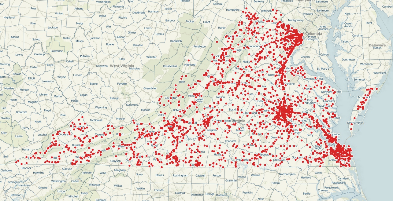
The Virginia Department of Transportation has shifted gears in its approach to open data.
Since 2013, the agency has used data visualization software Tableau to present its data on accidents and crashes in a more intuitive and useful way.
Try it
This can help citizens pull the lever of change if the numbers prove an intersection or road is dangerous.
“You can say I want to see I-95 in Fairfax County and only see fatalities,” said Keith Donley, the enterprise data manager at VDOT.
This can fuel “conversations about where the most dangerous roads are.”

With the use of Tableau, VDOT is also developing an internalized know-how for data visualization, allowing the agency itself to make better use of the tools. “Any time you can introduce a tool into the administration,” said Donley, “it’s a home run.”
In fact, VDOT has become so proficient in data visualization that it won the state’s Datathon competition in September. The contest pits Virginia’s government agencies against each other in a bid to create the best government app in 48 hours. VDOT’s team of six, led by Donley, created interactive dashboards to connect job seekers and employers in the tech industry.
So next time a hazardous crossing comes to your attention, verify for yourself how dangerous it is by fiddling with the VDOT data.
Analyze crash trends with VDOT’s data visualization tool


