Today, D.C.’s population stands at almost 700,000 — a four-decade high. But who are these 700,000 residents and how are they different than they were ten years ago?
For questions like this we turn to DataLensDC — Kate Rabinowitz’s exploration of city trends through data. Her latest blog post, originally written for the new D.C. Policy Center think tank, shows how race, income and age has changed in D.C.’s various neighborhoods between 2006-2011 and 2011-2015.
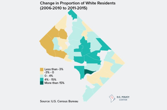
Here, for example, is the map showing change in racial demographics of the city:

(Image via DataLensDC)
The overall takeaway?
Yes, D.C. is whiter and wealthier and younger than it was a decade ago. But the effect is not the same in all neighborhood clusters. In some places, this trend doesn’t show up at all, Rabinowitz noted. But in others, it comes out in force.
“No neighborhood has changed more dramatically on these measures than Navy Yard, which stood out in each map for having the most significant change,” Rabinowitz writes. “The Navy Yard neighborhood saw a 29% increase in the proportion of white residents, an 18% increase in the proportion of households earning over $100,000, and a 15% increase in the proportion of young residents ages 22-34.”
Given this information, even the geographically-challenged should be able to spot the Navy Yard on the map above. It’s an impressively strong shift but, as Rabinowitz also points out, fairly easily explained by the rapid development of the area.
Before you go...
Please consider supporting Technical.ly to keep our independent journalism strong. Unlike most business-focused media outlets, we don’t have a paywall. Instead, we count on your personal and organizational support.
3 ways to support our work:- Contribute to the Journalism Fund. Charitable giving ensures our information remains free and accessible for residents to discover workforce programs and entrepreneurship pathways. This includes philanthropic grants and individual tax-deductible donations from readers like you.
- Use our Preferred Partners. Our directory of vetted providers offers high-quality recommendations for services our readers need, and each referral supports our journalism.
- Use our services. If you need entrepreneurs and tech leaders to buy your services, are seeking technologists to hire or want more professionals to know about your ecosystem, Technical.ly has the biggest and most engaged audience in the mid-Atlantic. We help companies tell their stories and answer big questions to meet and serve our community.
Join our growing Slack community
Join 5,000 tech professionals and entrepreneurs in our community Slack today!

The man charged in the UnitedHealthcare CEO shooting had a ton of tech connections

Northern Virginia defense contractor acquires aerospace startup in $4B deal

From rejection to innovation: How I built a tool to beat AI hiring algorithms at their own game


