We love maps.
For hundreds of years, they have helped us better understand our world. That understanding has grown wildly with time and technology, but, still, maps help.
In a place as inwardly focused, we have plenty of maps in Philadelphia. You also may know that we have something of a technology community here.
So there are resources like the Pennsylvania Spatial Data Access, or PASDA, which offers just a wild glut of GIS shape files for mapping geeks. We’ve seen cool mapping tools that are of broader scope though Philly got some love: from the addition of bicycle directions to Philadelphia Google Maps to the Google Building Maker to mapping the homes of those in the U.S. armed services who died in the Mideast this decade and many more.
But we wanted to highlight the coolest maps made for Philadelphia of Philadelphia.
Taking into account our own map obsessions, suggestions and calling out our community, we took on the task of listing, in no particular order, the 10 best online maps of Philadelphia.
MAPPING ABANDONMENT

Today, city development news site PlanPhilly released this Flash-map tracking the estimated 40,000 abandoned properties in Philadelphia.
It’s part of a major research project funded in part, like PlanPhilly itself, by the William Penn Foundation, that features heavy reporting from former Inquirer City Hall reporter Patrick Kerkstra. Yesterday’s feature includes an even more detailed, though more geographically targeted data-tracking map, seen here.
[Full Disclosure: TP co-founder Brian James Kirk is the Plan Philly web editor and was involved in the mapping development of this project.]
Find it here.
COMMONSPACE

In August, Technically Philly told you about CommonSpace, the web application designed to help uncover new businesses within walking distance of a location, and the excitement hasn’t worn off.
CommonSpace bumps off another similar project from Callowhill-based GIS software company Azavea: the cool, walkability map tool largely built by developer Aaron Ogle called Walkshed, which we’ve also covered.
Find it here.
PHILAPLACE

The dynamic and interactive oral history platform PhilaPlace from has recently unveiled new features and continues to seek more stories.
Find it here.
PHILLY HISTORY

The online home of two million archived photos from an array of city agencies and organizations is one of our greatest assets.
Its mapping feature could use a tune up, but it still offers a location-based search of photos that extend more than a century in age.
Find it here.
PHILADELPHIA SAFETY MAP

An entirely subjective map started by PhillySpeaks user dorydorado, this Google Maps overlay suggests what neighborhoods are safe, what are OK in the day and what should be avoided. …Let the condemnation and controversy continue.
Find it here.
H/T PhiladelphiaSpeaks
REDLINING IN PHILADELPHIA

The previous map brought about conversations on whether labeling some neighborhoods as ones that should be avoided was its own form of ‘redlining,’ the early 20th century practice of banks, insurance companies and other institutions mitigating perceived risk by increasing costs or avoiding service altogether in poorer neighborhoods with greater risk of crime.
Why not check out one of those very redlining maps, like this one from 1936 that is a clear enough example that it’s the image on the very Wikipedia page of redlining.
See it here.
1847 PHILADELPHIA

So, we’re not sure if this is, like, well known, but Philadelphia has something of a reputation for its American history.
It figures, then, that historians, academics, cartographers and hobbyists have more historical maps than we can keep track of. Scour the databases and websites of the Library of Congress, Temple (like MPIP) or Penn, historical societies and the like, and you will find plenty.
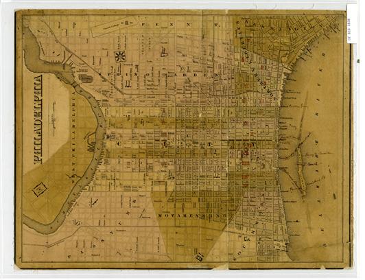
It’s hard to choose one to represent this world of maps, but here’s one, a beautifully preserved 1847 map of Philadelphia and its 10 mile environs — which includes most of today’s city because the map predates the 1854 county and city consolidation. Scan and zoom, scan and zoom.
You can find it here, as part of the David Rumsey Map Collection, where reproductions are sold.
PHILADELPHIA GEOHISTORY MAP OVERLAY

As suggested in the previous section, there are too many cool historical maps to see them all, so sometimes it’s best to get a bunch together and see how they compare.
Like how the Greater Philadelphia GeoHistory Network allows you to see more than a dozen maps in action.
Play with it here.
Also check out their specific maps, like this 1930 aerial survey of the city. The Free Library also has a very cool online map overlay collection of its own.
NBASE NEIGHBORHOOD MAP

The Cartographic Modeling Lab at Penn Design has a ton of interesting maps, none of which might be as controversial as one project breaking down the neighborhoods of Philadelphia.
Just like you won’t, Technically Philly can’t say we agree with all of the distinctions but, then, would it be fun if we did?
Find it here.
MAPPING DUBOIS

At the end of the 19th century, legendary historian and sociologist W.E.B. DuBois famously led a research project on behalf of the University of Pennsylvania to create a deep census of the 7th ward, then one of the densest collections of black Philadelphians of varying education and social levels.
More than 100 years later, Mapping DuBois was launched, bringing his research and 1900 U.S. census data to the friendly confines of web maps.
Find it here.
-30-
This is a semi-regular department we may or may not call Top Ten Tuesdays. There’s no judging in brainstorming. See others here.


