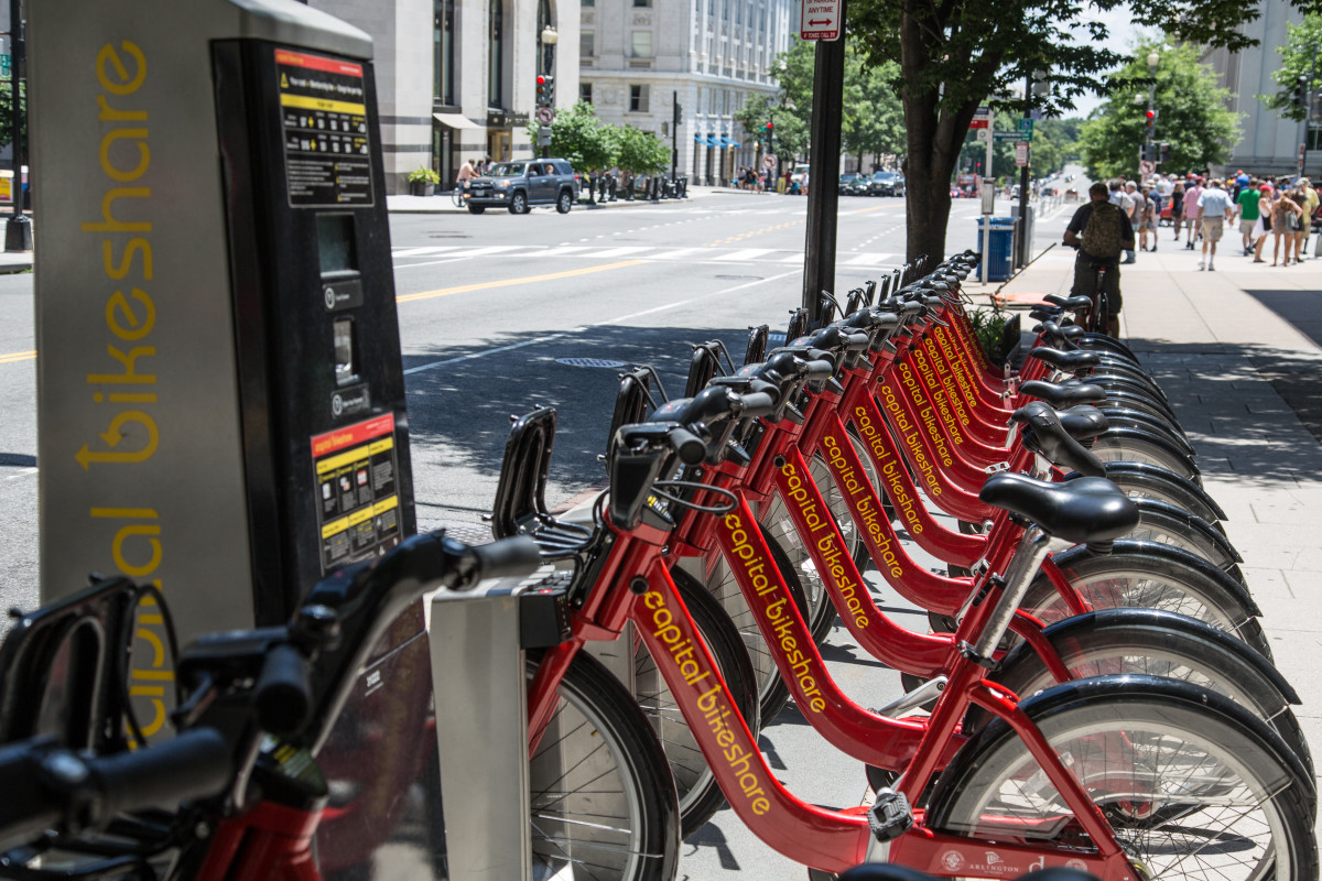
In spring 2015, the District Department of Transportation realized it knew almost nothing about the secret lives of Capital Bikeshare bikes. They just didn’t have the data.
So DDOT outfitted 130 bikes with GPS trackers and, starting on April 20, 2015, let them collect data until the batteries ran out. A few weeks later the department collected 94 of the trackers and began to think about interpreting all the new information. Ultimately, DDOT went to Virginia Tech’s Urban and Regional Planning program in Alexandria and asked for help.
This is all according to a Mobility Lab post by Jon Wergin, a recent graduate of the Virginia Tech program mentioned above, who has been digging through the Capital Bikeshare data as part of his capstone. On Tuesday he published the first in what promises to be a series of posts visualizing bikeshare rides taken in the District.
It’s pretty cool.
Wergin charted the path of a total of 3,596 bikeshare trips, showing the differences between rentals by members and rentals by “casual” tourists. As you might expect, casual trips tend to center around the National Mall, while member trips dominate the more residential/professional neighborhoods to the north.
Here’s what all the trips look like condensed into a single day:
https://www.youtube.com/watch?time_continue=152&v=y0sYziuaahU
Wergin also looked at average speeds and distances traveled for casual versus member users. Check out his work here, and keep your eyes peeled for the next post in this series — it’ll be about infrastructure usage.
Check out these cool Capital Bikeshare visualizations


