
This editorial article is a part of Technical.ly's Healthcare Technologies Month of our editorial calendar.
During a pandemic, data saves lives.
The all-volunteer-made COVID Care Map serves as a data science and visualization platform to help understand the healthcare capacity gap at the country, state, and county levels. The open-source tool maps resources like beds, ventilators, supplies and hospital staff, and its dataset aims to build an understanding of existing health capacity gaps as COVID-19 spreads and patients are in need of effective care.
Half a dozen engineers and designers at Callowhill-based GIS company Azavea are helping to develop the map. Rob Emanuele, Azavea’s VP of research, oversees all research and development at Azavea, including open-source projects, and told Technical.ly he’s been dedicating most of his time to working on the COVID Care Map. CEO Robert Cheetham thought contributing was an appropriate use of the company’s volunteer and disaster response time.
“As I dug into it, I realized this was a really valuable dataset to try to help health system planners understand resourcing issues,” Emanuele said.
The project has also integrated with Penn Medicine’s CHIME (aka COVID-19 Hospital Impact Model for Epidemics), another open-source tool that helps hospitals prepare for patient increases. There have been data science comparisons to show where capacity is and where CHIME predicts caseloads to be, Emanuele said. CHIME is run against regions, so there can be info on the number of COVID-19 cases an area could have in the future.
“What we’re working towards is to able to visualize those two things together, where you see where there’s going to be spikes in outbreaks and where there won’t be enough resources to satisfy that,” Emanuele said.
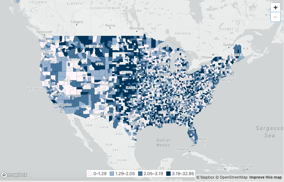
The maps show where hospital capacity could be lacking. Data is gathered from annual hospital cost reports, Emanuele said.
One map uses 2010 data from the Harvard Global Health Initiative to compare estimated ventilator counts in each state with available hospital beds, while the project’s main map shows U.S. hospital bed capacity per state, county, facility and referral region based on 2018 facility reports. There is data on staffed beds (regular and ICU), beds licensed for use, bed occupancy rate and ICU bed occupancy rate.
This particular visualization shows that ICUs in Philly operate at a 72% occupancy rate so COVID patients who need extensive care may not get it if there’s a shortage on beds or supplies.
The map only includes the most recent 2018 numbers right now. Emanuele said updates are in the works as new facilities pop up and non-ICU beds become ICU beds.
“We’re trying to work with other organizations to understand how we can have that dynamically updated by the hospitals themselves,” he said.
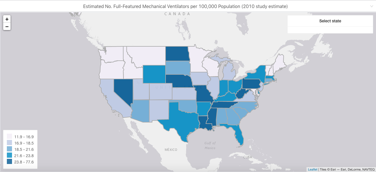
COVID Care Map’s Ventilator Supply and Healthcare Capacity Map, by State. (Screenshot via covidcaremap.org)
Join the conversation!
Find news, events, jobs and people who share your interests on Technical.ly's open community Slack

Philly daily roundup: Women's health startup wins pitch; $204M for internet access; 'GamingWalls' for sports venues

Philly daily roundup: East Market coworking; Temple's $2.5M engineering donation; WITS spring summit

Philly daily roundup: Jason Bannon leaves Ben Franklin; $26M for narcolepsy treatment; Philly Tech Calendar turns one
