Color. Shape. Meaning. All fundamental elements that need to be taken into careful consideration when designing a logo. Attention to detail is paramount. After all, a logo is both the face and identity of the brand it represents.
What about municipalities? How important is a logo to a city or a town?
The logo a city or town adorns might lure or deter potential new residents. But it can also affect the way existing residents perceive the place they call home. Then again, you may have absolutely no idea what your town’s logo is.
“When the locals say, ‘We need a new brand,’ part of what they’re saying is that the way they’re being portrayed is not the way they see themselves,” Purdue University professor Jonathon Day told The New Yorker last year.
So, we took a gander at the logos of 10 Delaware cities and towns (with populations over 5,000) and ranked them — completely subjectively, mind you. Really, there’s almost no science behind these rankings, just pure aesthetic judgement. What can we say? We know what we like.
1. Wilmington (pop. 71,305)
![]()
Wilmington takes the cake with this design. It’s not too flashy, but far from bland. It’s the Goldilocks. The grand slam. “On fleek,” as the kids like to say. Plus, they snuck that nice little “!n” sticker in there and even managed to slide in a slogan.
2. Milford (pop. 9,709)
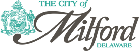
Class and elegance. Two thumbs up for the font choice, and that mellow teal juxtaposed with that clean slate gray screams, “Your only option is to be comfortable and content here!” The seal off to the left of the logo is just so mod chic.
3. Smyrna (pop. 10,180)
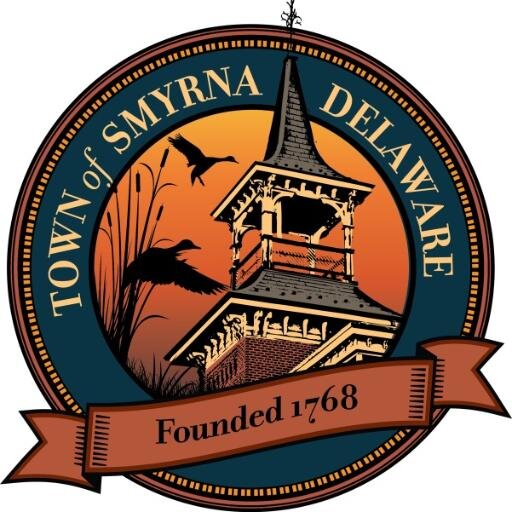
Smyrna, you sly dog, you. Why do we like your logo so much? It looks like the gauche, shabby wall decor that’s always available at literally every Welcome Center. It actually looks like it could be the cover of a Edgar Allan Poe collection you’re likely to find at Ollie’s.
There’s so much about this we just shouldn’t approve of (like, at all) — but somehow, for some unknown reason, we really like it. The pastel colors are non-abrasive. The whole design has pleasant gothic undertones. The “Founded 1768” ribbon reminds you that this is a town with a heart full of Americana.
4. Newark (pop. 31,618)
![]()
Oh, Newark. If only your city council would hurry up and approve your new logo, you might have been ranked No. 1. The current design is very simple — which we like — but it’s a bit too simple, a little too dated. What is that thing sitting on top of the text? We see what you were trying to do, but to be frank, you were much better off without it.
5. Georgetown (pop. 6,524)

Are you sad, Georgetown? Your logo is so … dark. Where’s the color? It’s like we’re living in Dorothy’s pre-tornado Kansas.
But there are positives, which is why Georgetown come in at No. 5, right at the middle of the pack. The font choice is refined. The steeple gives it a much-needed touch of craftsmanship. Extra points for the slogan.
6. Middletown (pop. 18,995)

What’s up, Middletown? Feeling a little divided? Can’t quite make up your mind? You’ve got two logos here, and neither are particularly inspiring. The one on the right could pass, just because we like the font. But that stale smattering of a logo caving in on itself to the left? Might want to ditch it before next year’s rankings come out.
7. Dover (pop. 36,560)
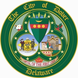
Strap in, folks, because it’s all downhill from here. Dover’s logo is an amalgam of everything you don’t want in a logo. First off, it’s really just a seal (Smyrna gets a pass for reasons we’re still not aware of yet). Secondly, there are 1.2 million things going on here.
There’s what appears to be a seal within a seal. There’s a castle and some knights, as if this is where the Magna Carta was signed. The ribbon at the bottom is too bendy. Founded in 1683 — and we doubt Dover has changed their logo since. We expected more from the state capital.
8. Elsmere (pop. 6,172)
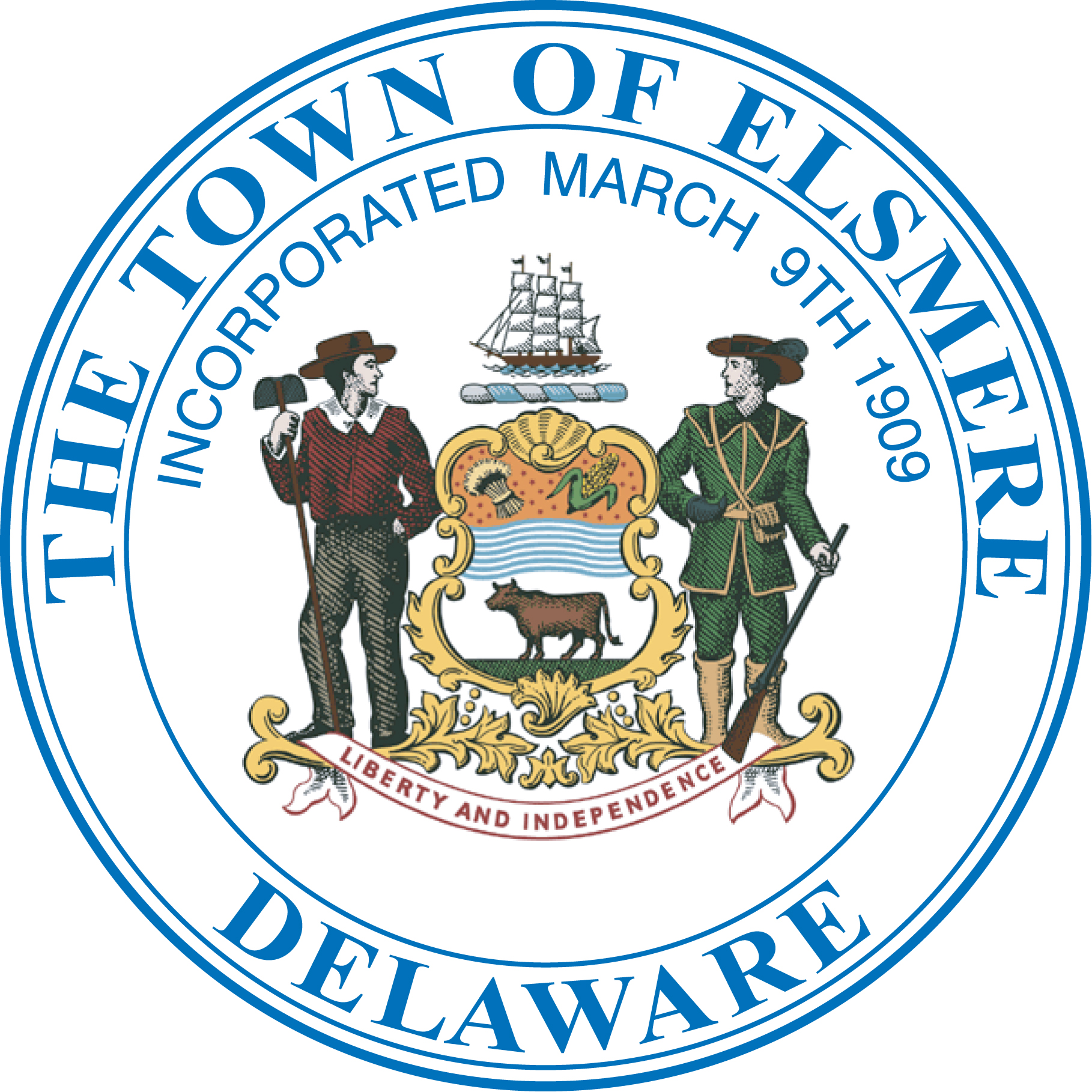
Behold, a postage stamp. Way to go, Elsmere. You even stole the interior image from Dover. We understand, though — there’s so much happening in Dover’s logo that it must be difficult for anybody to not end up stealing from them in some way.
9. Seaford (pop. 7,036)
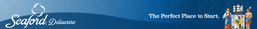 Yikes.
Join the conversation!
Find news, events, jobs and people who share your interests on Technical.ly's open community Slack

Delaware daily roundup: Delmarva Power vendor stats; DelDOT's $15M federal grant; 50 best companies to work for
Delaware daily roundup: Over 4,000 Black-owned businesses uncovered; Dover makes rising cities list; a push for online sports betting
Delaware daily roundup: Ladybug Fest illuminates small biz; Hahnemann Hospital's biotech future; intl. politics and a Middletown project
