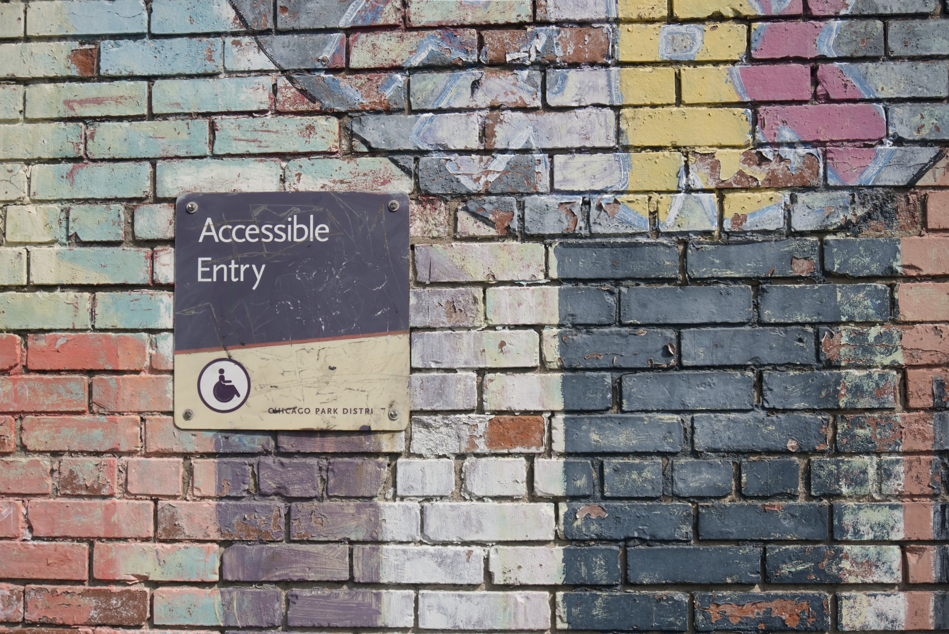
As the growing tech world is working to build diversity, equity and inclusion in its ranks and output, bringing consideration for accessibility into designs is another important way to contribute to equal access for all.
At SmartLogic, our team recently engaged in a pair of four-hour web accessibility training sessions, with the aim of internalizing accessibility best practices and helping us to build accessibility into our everyday approach to application development.
Here’s a quick rundown of some of our takeaways from the sessions:
Accessibility is for everyone
Accessible web design, much like curb cuts on sidewalks, improves usability for a wide range of people, including users with both permanent and situational disabilities. Situational disabilities can range from short-term limitations like standing outside in very bright light trying to read a cell phone screen, to longer-term situations like being effectively one-handed due to a broken arm or a newborn at home who you may be holding most of the time.
Accessible design choices make the web more usable and useful for everyone, and there are a number of low-impact design choices that we can make to improve access for a wide number of people.
Measure accessibility with tools and human judgement
The globally accepted accessibility standards are the WCAG 2.1. For each of these guidelines, three possible levels exist: A to AAA. They are rated based on level of impact, and number of people affected. Our trainers from TetraLogical recommended AA as the target to aim for.
While some aspects of accessibility can be run through automated testing with tools such as Google’s Chrome Lighthouse, some aspects of accessibility need human assessment. For instance, the tool can tell you whether an image has alt text, but it cannot tell you whether the alt text is helpful and meaningful in context. In the end, you need human judgement to fully assess accessibility.
Test your designs with your keyboard, and with a screen reader
Testing your site by navigating exclusively via keyboard, either with or without a screen reader active, is a great way to test for accessibility. We did a short exercise on day one using just the keyboard to navigate a common ecommerce platform, and the difficulty level was surprising and illuminating.
Likewise, testing with a screen reader can help you identify ways in which you may have created content that was visually well ordered, but may lack context or interaction options for those using a screen reader to navigate. A number of free and paid screen readers exist for both Mac and Windows platforms; spending even a little bit of time with them can help you spot accessibility issues in your application design.
Include accessibility behaviors in your designs
It is fairly common for the handoff from design to development to consist primarily of static visuals. But images do not convey interaction behavior or accessibility considerations. User stories that include accessibility behaviors should be created at the design phase, and developers should reach out to designers to clarify usability behaviors if they are not articulated in the design handoff.
Use good semantic markup
Well-structured, semantic HTML is the foundation of accessible web design.
Screen readers essentially traverse the document via the structures created in your HTML. So if your HTML is logical, clear, and efficient, it will be easier for users to traverse it. You can see the Accessibility Tree via the Chrome dev tools; if you have lots of empty divs in your HTML they’ll show up as “generic” elements, which is probably not going to create a clear and simple navigation experience for your screen reader users.
At a minimum, make sure to validate your HTML to make sure that your markup is structurally sound.
If you hide something visually, hide it from the accessibility tree, too
When interactive elements like dialog boxes, modals, and tab panels dynamically show and hide information, consideration needs to be made to not just visually hide that content. A modal box that pops up and grays out text behind it is a clear visual indicator, but if the content is not also removed from the accessibility tree, a screen reader user can end up interacting with content that is intended to be unavailable until the modal is addressed.
Tabindex is a property that can be used to add or remove elements from the accessibility tree. Giving an element a property of `tabindex=-1` will remove it from the accessibility tree; `tabindex=0` can then be used to bring the elements back into the accessibility tree when appropriate. Using `tabindex` values of 1 or greater is not recommended as it disrupts the interaction order of content on the page.
Make sure each interactive item has the correct role, state, and property…
Sometimes in making design implementation choices, we reach for something that visually looks right but is semantically incorrect, like using a span instead of a button, or using an H3 instead of an H2 because of the font size.
With any interactive element, having the correct role, property, and state is necessary to make sure the elements are available for interaction via the keyboard. For example, a span is not focusable in the way a button is, so while a cleverly designed span may look like a button and be obviously clickable, it will not be usable for screen reader and keyboard users.
…but good plain HTML is better than badly implemented ARIA
ARIA (Accessible Rich Internet Applications) is a way to extend accessibility to interactive applications and non-native HTML components like tab panels, alert dialogs, feeds and other custom elements.
Though ARIA can be used to polyfill missing role, name, and state information for screen readers, if a given element can be created using native HTML and behavior, it should. Native HTML components have default values and behaviors for role, property, and state, and duplicating or overriding that behavior with ARIA should typically be avoided.
The good news is that there are great examples of accessible designs for most common web components
The ARIA design pattern examples are thorough and well-written, and include both example code and live running interactive demos. If you’re not sure where to get started with a complex interactive component, the design pattern examples are a great place to start.
Make it better than yesterday
Our instructor closed our session out with this statement:
It doesn’t have to be perfect, it just has to be a little better than yesterday.
Accessibility in web design, as in the physical world, is a spectrum; even small accessibility improvements contribute to a more usable web for all of us.
Accessibility as a consideration may seem to be more complex or add effort. But at its foundation, good accessible design overlaps strongly with good coding and design practices. By taking accessibility into consideration, you will be not only improving the experience for your users, you will be building better applications.
Join the conversation!
Find news, events, jobs and people who share your interests on Technical.ly's open community Slack

Baltimore daily roundup: Medtech made in Baltimore; Sen. Sanders visits Morgan State; Humane Ai review debate

Baltimore daily roundup: An HBCU innovation champion's journey; Sen. Sanders visits Morgan State; Humane Ai review debate

Baltimore daily roundup: The city's new esports lab; a conference in Wilmington; GBC reports $4B of economic activity